What is the 60/30/10 Color Rule in Interior Decorating?
When you start decorating your home, you might feel overwhelmed by all the colors and choices available. Picking the right colors is important because they make a big difference in how a room feels. That is where the 60/30/10 color rule in interior decorating comes in. It is a simple guide that helps you use colors in a way that looks balanced, beautiful, and easy on the eyes. Even a 10-year-old can understand it easily when explained the right way. Let’s walk through what this rule is, why it works, and how you can use it to create stunning rooms.
What is the 60/30/10 Color Rule?
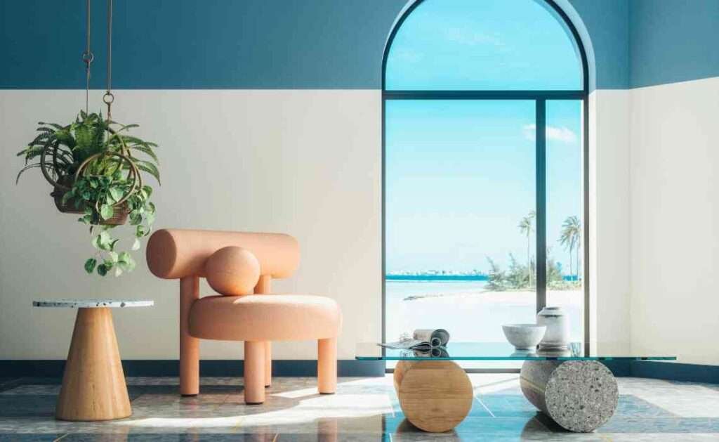
The 60/30/10 color rule is a simple formula used in interior decorating to balance colors in a room. It breaks down how much of each color you should use. The idea is that 60% of the room should be your main color, 30% should be your secondary color, and 10% should be your accent color.
Main Color (60%)
- This is the color you will see the most in the room.
- It usually goes on big areas like the walls, large rugs, or big furniture like the sofa.
- This color sets the overall feeling of the room, so it should be something you really like and find calming or exciting depending on the room’s purpose.
Secondary Color (30%)
- This color supports the main color but adds some variety.
- You will see it in things like curtains, bedding, or smaller pieces of furniture like chairs.
- It should still match the main color but be different enough to make the room look interesting.
Accent Color (10%)
- This is the fun color that adds pops of excitement to the room.
- You will usually find it in things like pillows, lamps, artwork, and small decorations.
- It is usually a bold or bright color to grab attention and make the room lively.
Why the 60/30/10 Rule Works
The 60/30/10 rule works because it keeps a room from feeling too plain or too crazy. When you have too much of one color, the room can feel boring. If you have too many different colors, it can feel overwhelming and messy.
By sticking to this balance, your room looks organized but still colorful. The main color creates harmony, the secondary color adds depth, and the accent color adds energy. It makes designing a room feel less like a big scary task and more like following a fun recipe.
How to Pick Your Colors
Start with the Main Color
- Think about how you want the room to feel. Calm? Cozy? Energetic?
- Soft colors like light blue, beige, or soft gray make a room feel calm.
- Warm colors like terracotta or mustard yellow make it feel cozy.
- Bright colors like teal or emerald green make it feel lively.
Choose a Secondary Color
- Pick a color that looks good with your main color.
- It can be lighter or darker than your main color or even a different shade altogether.
- Make sure it is different enough to stand out but not so different that it clashes.
Select Your Accent Color
- Choose something that pops!
- You can pick a bold color like bright yellow, ruby red, or turquoise.
- The accent color is where you can be brave and have fun without worrying about overdoing it.
Easy Ways to Apply the 60/30/10 Rule
Walls and Floors
- Paint most of your walls in the main color.
- Your floors or big rugs can also match or complement the main color.
Furniture
- Big furniture like the sofa, bed frame, or dining table should follow the main color or the secondary color.
- Smaller furniture pieces, like a cozy armchair or side tables, can show off your secondary color.
Decorations
- Use pillows, picture frames, vases, and artwork to add your accent color.
- It is okay if these items are small because even small pops of color can make a big difference.
Example Room Using the Rule
Imagine a living room where the main color is a soft gray (60%). Most of the walls are painted gray, and there is a large gray sofa. The secondary color is navy blue (30%). The curtains, a comfy armchair, and a few throw blankets are navy blue. The accent color is bright yellow (10%). There are yellow pillows on the sofa, a yellow vase on the coffee table, and a yellow lamp on the side table.
When you walk into that room, it feels balanced, stylish, and cheerful without feeling too plain or too wild. That’s the magic of the 60/30/10 rule!
Tips to Make the 60/30/10 Rule Work Even Better
Stick to Three Main Colors
- If you add too many colors, the room can start to look messy.
- Try to stick to the three colors you picked to keep things simple and beautiful.
Play with Textures and Patterns
- Even if you use the same colors, different textures and patterns can make the room more interesting.
- Think about things like a fluffy rug, a shiny lamp, or a patterned pillow.
Adjust the Rule Slightly if Needed
- Sometimes you might want to bend the rule just a little.
- Maybe you want two accent colors that share the 10%.
- That is okay! The idea is to create balance, not to stress over exact numbers.
Common Mistakes to Avoid
Choosing Colors Without Testing
- Colors can look very different depending on lighting.
- Always test paint colors on your walls before committing.
Ignoring Your Own Style
- Just because a color combination is popular does not mean it is right for you.
- Choose colors you love so that your space feels like home.
Forgetting About Lighting
- Natural light can change how a color looks throughout the day.
- Think about how much light your room gets and what kind of lightbulbs you use.
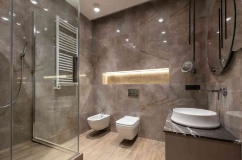
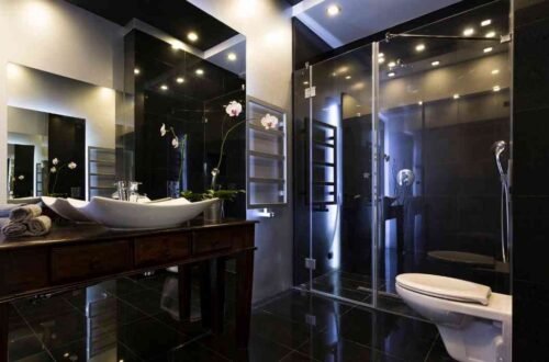
Can the 60/30/10 Rule Be Used in Every Room?
Yes, it can! Whether you are decorating a living room, bedroom, kitchen, or even a bathroom, the 60/30/10 color rule works everywhere. It is a universal decorating tip because every space benefits from balanced color use.
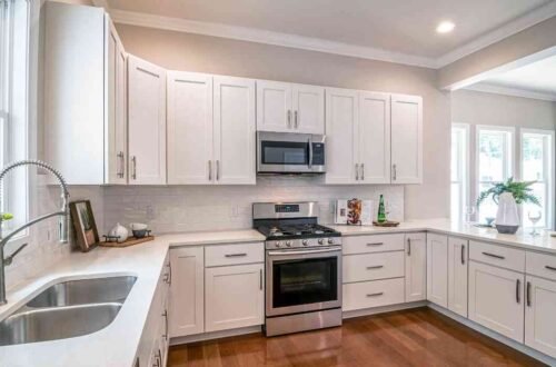
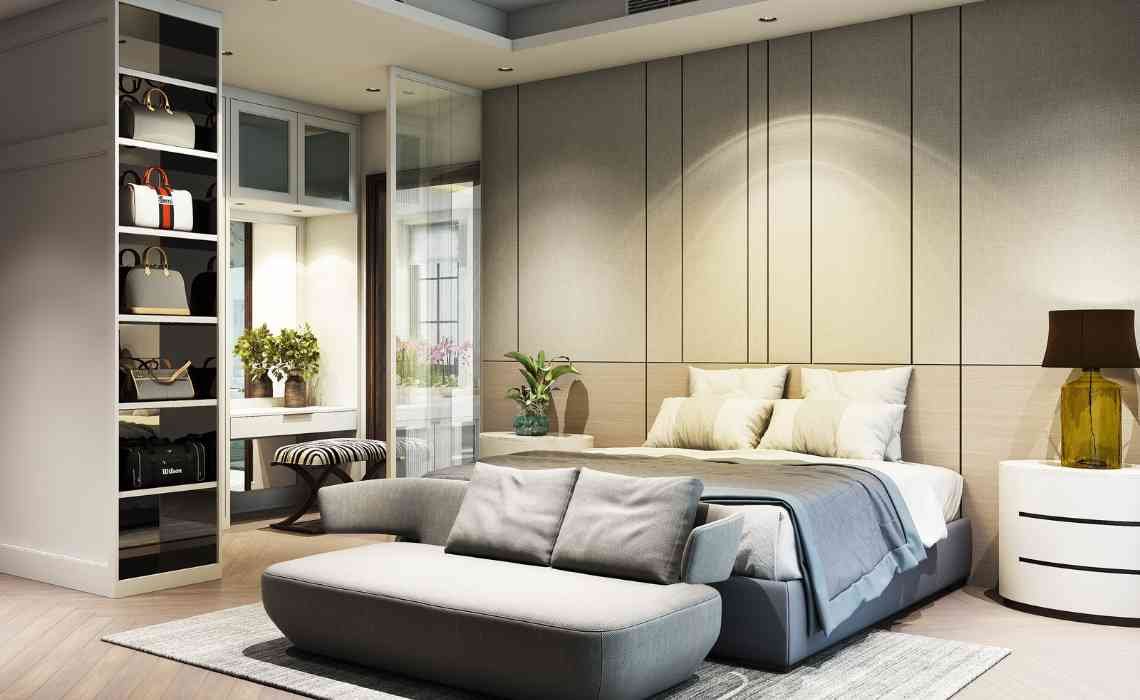
For example, in a bedroom, you might have a light lavender wall (60%), deep purple bedding (30%), and silver pillows and decor (10%). In a kitchen, you could have white cabinets (60%), navy blue bar stools and backsplash tiles (30%), and golden handles and small appliances (10%).
You can even use it in outdoor spaces like patios. Imagine soft beige walls (60%), forest green cushions (30%), and bright red flower pots (10%). The possibilities are endless!
Why Kids Can Learn and Use the 60/30/10 Rule Too
The best part about the 60/30/10 color rule is how easy it is to understand. You do not need to be a grown-up designer to use it. Even kids can follow this rule when decorating their rooms.
For example, if a child loves blue, green, and orange, they can paint their walls light blue (60%), have green bedding (30%), and use orange for small things like a clock, a chair, or posters (10%). Their room will look colorful, but still neat and comfy!
Interior decorating does not have to be complicated. The 60/30/10 color rule is a simple and powerful tool that anyone can use to create a balanced, beautiful space. It takes the guesswork out of decorating by giving you a clear plan to follow. By choosing a main color for 60% of your room, a secondary color for 30%, and an accent color for 10%, you can design rooms that feel just right. Remember to pick colors you love, test them in your space, and have fun with it. Your home should feel like a happy, welcoming place where you enjoy spending time.