What is the 70-20-10 Rule in Home Decorating?
When you are trying to decorate a room, it can feel a little overwhelming. You might wonder how to mix colors without making the room look too crazy or too boring. This is where the 70 20 10 rule in home decorating becomes a big help. It is a simple guide that anyone can use to make their space look balanced and beautiful. Even if you have never decorated before, this rule can make you look like a pro.
In this blog post, we will break down exactly what the 70 20 10 rule is, why it works so well, and how you can use it in your own home. We will also give you plenty of easy examples, so you can picture it clearly. Let’s dive in and learn how you can create a stunning space with just a few simple steps.
What is the 70-20-10 Rule in Home Decorating?
The 70 20 10 rule in home decorating is a basic formula for using color in a room. It tells you how much of each color you should use to make the space feel just right. Here is how it works:
- 70% of your room should be the main color (called the dominant color).
- 20% of your room should be the secondary color.
- 10% of your room should be the accent color.
This rule is like a recipe for decorating. Just like you follow a recipe to bake a cake, you follow this color recipe to design a beautiful room.
Let us explain each part in more detail:
What is the 70% in the Rule?
The 70% part is the main color that covers most of the room. This is usually a neutral or soft color because it is meant to be easy on the eyes. Think about walls, large rugs, big pieces of furniture like your couch or bed. These big things should mostly be in the dominant color.
For example, if you choose a light grey as your main color, you would paint your walls grey and maybe have a grey couch too. This makes your room feel calm and pulled together because everything matches nicely.
Choosing a simple, calming color for your 70% makes it easier to add other colors later without the room feeling too busy or messy. It sets the mood and tone for the whole space.
What is the 20% in the Rule?
The 20% part is the secondary color. This color should support and enhance the main color without taking over. It should still be noticeable but not louder than the dominant color.
You use the secondary color for things like chairs, curtains, smaller rugs, or even one wall if you want an accent wall. This color adds interest and makes the room more exciting, but because it is only 20%, it does not feel overwhelming.
For instance, if your main color is light grey, you might pick navy blue as your secondary color. Your navy blue chairs, throw pillows, or curtains will pop against the soft grey, making the room feel more alive.
Choosing a bold but friendly color for your 20% makes the room more stylish and gives it character without overpowering everything else.
What is the 10% in the Rule?
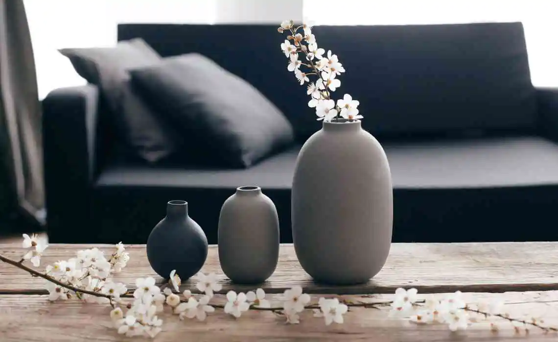
The 10% part is your accent color. This color is where you have the most fun. It is supposed to be bold, bright, or unexpected. You use this color in small ways, like in art, decorative pillows, vases, lamps, or other accessories.
Using only 10% of a strong color keeps it exciting without making the room feel too loud or crazy. Think of it as the sprinkles on top of a cupcake. Just a little makes a big difference.
If your room is mostly grey with navy blue chairs, you could add a few bright yellow pillows and a yellow vase. That little bit of yellow would make the whole room sparkle without making it feel too busy.
Picking a fun and lively color for your 10% makes the space pop and feel more interesting without overwhelming the eyes.
Why the 70-20-10 Rule Works So Well
You might wonder why this rule is so popular and used by so many decorators. The answer is simple. It brings balance, keeps things interesting, and makes decorating much easier.
It Brings Balance to the Room
Balance means that no one color screams louder than the others. If everything in a room were bright red, it would feel too heavy. If everything were plain beige, it might feel boring. The 70 20 10 rule helps you mix colors in a way that feels calm but not dull.
When your dominant color covers most of the room, it gives a strong base. The secondary color brings in some variety, and the accent color adds just the right amount of excitement.
Using this balance makes your room feel welcoming and comfortable.
It Makes Decorating Easier
Sometimes, too many choices can make decorating hard. There are so many colors, patterns, and styles out there. The 70 20 10 rule acts like a helpful friend that tells you exactly how much of each color to use.
You do not have to guess or feel confused. You simply pick one main color, one secondary color, and one accent color. Then you use them in the right amounts. Decorating becomes a lot more fun and a lot less stressful.
It Keeps the Room Looking Interesting
A room with just one color can feel flat. A room with too many colors can feel messy. The 70 20 10 rule makes sure your space always looks interesting but never too wild.
You get the best of both worlds: a room that feels peaceful but also has enough energy to make you smile when you walk in.
How to Choose Your Colors for the 70-20-10 Rule
Choosing colors can still feel tricky, even with a helpful rule. Here are some simple steps to make it easy:
Start with Your Dominant Color
Pick a color that you love and that feels calm. Whites, greys, beiges, soft blues, or light greens work great. These colors are easy to live with every day because they do not tire out your eyes.
If you already have a couch or rug you love, you can choose your dominant color based on that.
Pick a Secondary Color
Now choose a color that goes well with your main color but is a little bolder. Look at a color wheel if you need help. Colors that are next to each other on the wheel (like blue and green) usually look nice together. Or you can pick a color that is opposite for more contrast (like blue and orange).
Make sure the secondary color feels happy when you put it next to your main color.
Add a Fun Accent Color
Finally, choose a color that is bright or unexpected for your accent color. Metallics like gold or silver can be accents too. If your room feels a little too soft, a bright color like pink, yellow, or teal can bring it to life.
Your accent color is where you can be brave. Because you are only using it in small doses, you can really have fun with it.
Real Life Examples of the 70-20-10 Rule in Home Decorating
Let’s see how this rule works in real rooms. These examples will give you ideas for your own space.
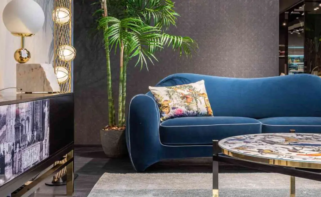
Example 1: Calm and Cozy Living Room
- 70% Light beige walls and large beige sofa.
- 20% Soft sage green chairs and a green patterned rug.
- 10% Burnt orange throw pillows and a few orange art pieces.
This living room feels warm, cozy, and relaxing but still interesting because of the pop of orange.
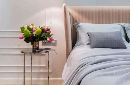
Example 2: Bright and Cheerful Bedroom
- 70% Soft white walls and white bedding.
- 20% Navy blue side tables and a navy rug.
- 10% Sunny yellow pillows, lamp, and artwork.
This bedroom feels fresh and happy, with just the right amount of cheer from the yellow accents.
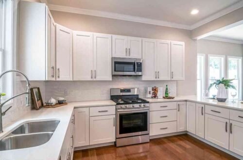
Example 3: Stylish and Bold Kitchen
- 70% Pale grey cabinets and walls.
- 20% Deep teal kitchen island and chairs.
- 10% Brass light fixtures and small gold decor items.
This kitchen feels modern and stylish, with a little sparkle from the brass accents.
Tips to Make the 70-20-10 Rule Even Better
Here are a few extra tips to help you use the 70 20 10 rule like a real decorator.
Keep Patterns in Mind
When you use patterns, think about them as part of your colors. A striped rug with your secondary color and dominant color can count for both. Patterns can make a room feel more layered and cozy.
Remember Texture
Texture means how something feels, like rough, smooth, soft, or hard. Different textures can make even one color look interesting. For example, a soft velvet grey couch and a rough grey stone fireplace are both grey, but they feel very different.
Mixing textures keeps your room from feeling flat even if you use simple colors.
Do Not Be Afraid to Break the Rule (Just a Little)
The 70 20 10 rule is a great guide, but it is okay to bend it a bit to fit your style. Maybe you want two accent colors instead of just one. Or maybe your secondary color is a little stronger. As long as your room still feels balanced and happy, you are doing it right.
Decorating should feel fun, not like homework. Trust your eyes and your heart.
The 70 20 10 rule in home decorating is one of the easiest and smartest ways to make any room look amazing. By choosing a dominant color for 70% of the room, a secondary color for 20%, and a bold accent color for the last 10%, you can create a space that feels balanced, exciting, and totally you.
Whether you are decorating your living room, bedroom, or kitchen, this simple rule gives you the confidence to mix colors like a pro. With a little practice, you will be able to create rooms that look like they belong in a magazine. Happy decorating!